
For example, on the first poster I like how dark they have made the background and how some of the features on the characters face aren't completely visable. This create tension and fear as the audience don't fully know who this character is and what his aim in the film is going to be.
Also this poster uses a short slogan, 'someone is missing' but it has such an impact on the audience and we wonder who they mean and why they are missing. Creating more tension and fear.
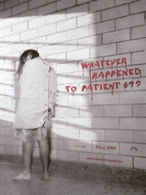
The second poster is completely different to the first one as it is much lighter and less is happening of the feature.
I like how they have written a different slogan that is more related to the film and how it is placed as if it was really written on the white brick wall.
No comments:
Post a Comment