Monday 4 April 2011

Evaluation: How Did You Use New Media Technologies In The Constructions And Research, Planning And Evaluation Stages?


Above are pictures of myself holding the equipment that we used to create our final product. As a group we all took turns in using the digitatl camera to record our footage. With some of the footage we used the tripod to get a sturdy, accurate shot of the image.
We did use a microphone while filming all of our footage, however, once we got to editing our product we decided to have the whole thing silent.

Once we had finished with our filming we editing everything together in Adobe Premiere.

We found the music that we used on www.youtube.com
And then we converted it from youtube by using www.listentoyoutube.com
We also used another converter called www.mediaconverter.org which allowed us to gain the possession of  the Legendary Pictures production sequence.

We used blogger to upload our daily encounters.
And we also used Slideshare to create an animated storyboard.

Evaluation: What Have You Learned From Your Audience Feedback?


Our teaser trailer doesn't remind me of just one trailer as we have used different aspects of other horror teaser trailers, we used aspects from 'Scream' and 'The Strangers' for the footage and close ups of the Killer in the mask. And we also used aspects from 'The Blair Witch Project' with the hand held footage and the night vision effect. However, we also did use our own imaginations (ie. having the footage sped up and rewound at the end to make the audience feel confused and uneasy).

The strengths of our teaser trailer that I think are:
  • The speed of the frames create the confusing and create the montage of the events that the audience will be witnessing throughout our product. I think this is a strength because this emphasises the tension and suspense that we were wanting to impact our audience with.
  • Another strength is the way we did the inter-titles. The inter-titles that say 'The Haunting Of Therfield' and 'Don't Cross The Line..' These inter-titles quickly flash on to the screen and then re-appear so that the audience can read them. The fact that they quickly flash on makes the audience confused to whether they were supposed to be like that but then because they re-appear the audience feel slightly better.
  • Our teaser trailer is an original narrative as we haven't used any other type of footage or scenes from another horror genre film.
The weaknesses of our teaser trailer that I think are:
  • I think that the main weakness of our teaser trailer is that the music of our production company is too loud and doesn't fit well with our non-diagetic music of the trailer. The sound from the production company is completely different to our own choice of music, this throws off the audience of the eeriness and mystery of the teaser trailer.
  • Another weakness is the scenes that we used with the dog. This is because you can see the hand of the Killer making the dog growl. However, this does make the audience feel uneasy and nervous and it shows that the Killer is inside someones house.
Audience feedback from social networking sites:
  • 'Its really good guys well done, just one thing is that the trailer doesnt really tell you anything about the film like any plot or anything its all very vague?'
  • 'I like the bit with the writing, where it looks like she is erasing it. I thought it was really effective as it could show the character is trying to erase her actions. I also liked the contrast between the Black and White colour scenes and the Coloured scenes.
  • 'good bits:
    ambiguous plot, makes people want to find out more
    editing is really quick by the end which makes it really exciting? idk its cool :)
    the reverse thing is really cool & memorable :)
    i liked the nightvision & how you can only just see the person in the background, tis creeeepy
    i liked the jumpy bit with the murderer (where they move really suddenly)
    maybe its a little too vaigue, but tis no biggie'
  • 'Overall this is a really good video. It's really well put together and I think that the quick editing works really well with the horror genre. The green night vision effect looks really creepy. Also the fact that you've made Hannah and Milly smile and act normal makes it seem even scarier, in the sense that it could happen to ANYONE. The music fits in really well and adds a really creepy effect to the whole video. The only negative comment I have is that I feel in places, the plot isn't clear.'

Evaluation: How Effective Is The Combination Of Your Main Product And Ancillary Texts?

As a group we filmed ourselves talking how our product and ancillary texts are all linked together and appeal to our target audience.

Evaluation: In What Ways Does Your Media Product Use, Develop Or Challenge Forms And Conventions Of Real Media Products?


Shot 1: We chose to have our title in the centre of the shot in bold (Birch STD) font. This makes the title stand out to the audience and it also is large enough so that the audience can read it. Having the title of the film on a black scene is very similar to other horror genre products such as; Scream, The Strangers, Blair Witch Project and Saw. I think our title of our product follows the conventions of a real horror genre teaser trailer.
Shot 2: This shots shows our audience the setting and location of our product. It shows the audience the Killer standing aimlessly around some garages and houses. We used this area as it was very realistic to our narrative of product. Having the houses behind the Killer makes the audience wonder what they are doing in that area and whether the Killer has found their target. Having the Killer down an alley way next to some garages makes the location seem deserted. The audience will feel uneasy as you can come across this area in your daily lives. Once again this shot follows the convention of a horror genre product as the location is somewhere familiar to all the characters and also the audience. Knowing that something bad can happen in a safe environment creates the tension we wanted.
Shot 3: Here is a shot of the Killer in the mask. This character was the only one that really had a costume and a prop that the audience wouldn't be use to seeing. As the Killer is the horrorfying character that uses the mask to scare their victims as well as the audience, we decided to use similar shots to this as our main image of our poster and magazine front cover. This is because the mask is our unique selling point, (like Scream).
The mask that we used has its own theatrical features creating suspense and mystery to who is behind the mask.
Shot 4: This shot is of Amelia being dragged backwards. The shot is at a cantered angle to make the audience sit on the edge of their seats and have the tension build up. This shot is also our beginning scene which helps with the tension building. We changed the colour of the scene to an effect called 'old film' to make the audience wonder whether this film is contempory or vintage. Also with this shot, that we couldn't capture in a screen grab is that we time stretched this scene by having Amelia seeming as if the Killer is pushing her forward rather than dragging backwards to make the audience uneasy. This isn't something I have seen in a horror genre product, however, I don't believe that this challenges the conventions of a horror genre product.
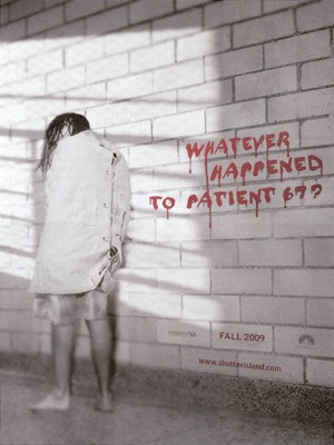
Shot 5: The title font and style of our teaser trailer, poster and magazine front cover all follow the same theme. We used 'Minion Pro Black 89' style which is what creates the ghost like background which makes the inter-titles bold and stand out so that it attracts the attention of our target audience. Then we decided to use 'Birch STD' as the font for all inter-titles and font used on our ancillary texts. This is so that all three advertising texts are linked together and look professional so that our audience will appreciate the texts and watch our product. The text is quite gothic creating suspense and tension for the audience as the font is creepy like our product.
Shot 6: Our teaser trailer is very ambiguous which isn't always used in other teaser trailers. We decided to make our product like this because if our product was ever made into a feature our narrative wouldn't be linear. However, with this shot in the screen grab it slightly shows the audeince a glimps of what the characters are trying to do and what the narrative is going to be about. The shot says 'we want to join' which we used to make our audience ask themselves many questions to what the meaning of this phrase could mean, creating more mystery throughout the product.
Shot 7: This shot of the Killer with a knife shows the audience that our product is a horror genre product. The audience will be able to realise that our product is horror because of the Killer's intentions of violence towards the character who is on the floor about to be attacked by a knife.
Shot 8: Throughout our teaser trailer our characters have been introduced. With this shot though the audience are properly introduced to Amelia who is the main victim character. Amelia is an conventional character that you would see during a horror films she is the typical blonde girl.
Shot 9: We used one type of special effect and that was our night vision scenes (green shots). We decided to use the night vision effect to make the hand held footage more realistic so then the audience can relate to the scenes they are witnessing. The effects also show that the characters were planning on staying up and filming throughout the night. This makes the audience feel uneasy as they know that something bad is going to happen.

Monday 21 March 2011

Certificate Rating

Here is a table that shows how films are giving their age rating. We used this table to help us gather what age rating our feature should be. I think that our film should be a certificate 15 this is because our film is a horror genre. Many other horror genre features like ours are rated 15 so this rating would be appropriate for our feature. Also some of our shots in the teaser trailer show violence which would not be suitable for under 15 year olds to view.
Today we took some photos of The Killer that we could use for our ancillary tasks. We used a digital camera to capture our pictures as this would mean they are better quality images and larger.


We decided to take some images that were similar to "The Uninvited'. With a character leaning against a window as this is off-putting and uneasy for the audience. Also we took some images where the killer is at different angles adn positions to see which would be best for our ancillary tasks.


With these two images we did a close up of the Killer's mask/face. Similar to 'Scream' and 'The Ring' as the audience only has one thing to focus on which happens to be the character that they should fear.

Friday 18 March 2011

More Poster Idea's

Once again here are another couple ideas for our poster. However, they are also snapshots from our teaser trailer so the quality of these images are not very good.
We have planned to take pictures using a digital camera to get better resolution images.


We decided to keep the images black and white. But copy and paste the killer standing in different areas of the same shot and reverse them so that the characters looked eerie and suspicious. The audience are left wondering whether there are a high number of killer characters or is it just one.
I don't believe we are using many aspects of these ideas just the black and white aspect of the image.

Font Idea's For Our Magazine

Here are some font styles and title font arrangement that we are thinking about using for our magazine front cover.

We have decided to create our own magazine for the fact that whilst doing research into magazine front covers, we found that the main media magazines do not feature horror genre films on their front cover
So we have decided to call our magazine 'Horror Review'. We thought about having our title similar to 'Total Magazine' so that the 'review' part of our title would be placed inside a section of 'Horror'. However, we decided that this isn't very eerie to use for a horror genre film magazine.

We decided to try fonts that seemed more gothic and eerie. For example, Franklin Gothic Demi and Rockwell.
We tried different ways of having the review placed at different areas of 'horror' and in a smaller size font and in a different colour to 'horror' this is so that the audience of our magazine know that our film is mainly going to have horror genre films feature in our magazine and that also our magazine will be full of different reviews and opinions of the new horror films thats are going to be released.

Our Poster Idea's

Here are a couple idea's for one of our ancillary tasks - the teaser poster. We thought that it would be really creepy to different to have stripes of colour of the same image on the top of a black and white image.
We tried different images and different sizes of stripes and different colours. We did think that the image looked different but it wasn't as tension building and as eerie as we would like.

Another problem was that these were just print screens from our main project - the teaser trailer. This meaning that the images are very low quality resulting in the poster not looking the best it could.

One Miss Call Poster Analysis

I really like 'One Missed Call''s teaser poster as it only has the creepy face of the evil character surrounded by a complete black background. This showing the audience all the features of the characters.
I also like how they have used a mouth and nose to create the eyes of the centre characters which is very eerie and frightening.


Once again, like many other horror genre posters, they have used a slogan to draw in thir audience and make them feel the fear as it gives the audience an idea of what the film is roughly going to be about.

The Ring Poster Analysis

The first 'The Ring' poster is something that we could use similarly for our ancillary tasks as they have used the evil character as their selling point in this poster.
The features of the evil character is also the feature of the poster that creates the fear and tension in the poster and let the audience know that this film is a horror.
I also like how the title of the film is extremely large and bold. As well the poster using the same theme throughout this poster of using different shades of blue, the charcater is a very light blue, the setting is a darker blue and the title is an even darker blue. Making all the features stand out from each other but work perfectly to attract their audience.


The second poster doesn't use and characters but it does use the image of the television set of how this character is supose to come out and kill her victims.
It also tell the audience the slogan, 'before you die. you see the ring' which they have combined with the title. I think that we should create a slogan as many horror genre posters and used one and it helps create the fear the audience feel before seeing the film.

The Haunting in Connecticut Poster Analysis


Both of these posters are dark and gothic with the black and brown backgrounds. Both of the posters use the same font  for the title and for the information giving to the audience. This film is also based on true events which the audience are told, this making the film already seem more frightening and terrifying before they have seen it.
However, the images are different. The 1st one is a distant picture of people round a table which creates confusion to what they are doing and how is represents the film. However, the second poster shows some sort of alien object coming out of a little boys mouth. This disturbing the audience and most likely horrifying them but this is also what will make them go see it in the cinema to see what the object is.

Shutter Island Poster Analysis

'Shutter Island' is more of a psychological thriller but I liked the poster that they created for this film.
For example, on the first poster I like how dark they have made the background and how some of the features on the characters face aren't completely visable. This create tension and fear as the audience don't fully know who this character is and what his aim in the film is going to be.
Also this poster uses a short slogan, 'someone is missing' but it has such an impact on the audience and we wonder who they mean and why they are missing. Creating more tension and fear.


The second poster is completely different to the first one as it is much lighter and less is happening of the feature.
I like how they have written a different slogan that is more related to the film and how it is placed as if it was really written on the white brick wall.

The Strangers Poster Analysis

'The Strangers' teaser posters are different but have similarities as well.
On the first poster I like how they have made it look like a newspaper clipping. And how it isn't in colour which shows that the film is going to be dark and disturbing. They also have made the title of the film big and bold whereas, one of the slogans they used is small about the killer characters head.
I like how they have used one of the killer characters as the main feature of this poster and have the other killer characters faded ghost like into the background. I think this will frighten the audience as the character they can see is holding a knife but if the look closely they will be able to see the other characters they need to be aware of.


With the second poster they used Live Tylers character when she is badly hurt and crawling. This shows the audience that something terrible and horrifying is going to happen during this film. However, nothing is giving away which draws in their audience and result in them going to the cinema. Once again they have made the title large and bold so that is stand outs.
I like how they have made the background a light colour which could be a tension builder as we know from the image that this film is going be dark however, the colour makes the sense that it isn't going to be that bad.
Underneath the title they have also let the audience know that the film was inspired by true events which immediately makes the film that more eerie and frightening.
I like the 3rd poster because they have put all of the five main characters onto the poster, the three killers whose masks you can see which makes the audience know that they are the characters that are in controll of the events that will happen during the film and the two victims who are facing the killers.
Also with this poster they have added the actors names of the victim characters so that the audience already feel sympathy towards them before knowing fully what happens to them.

Saw Poster's Analysis

Here are the 1st four teaser posters of the 1st four 'Saw' films. All four of them follow the same theme of having a white background and using human body parts as the main feature of the poster. This making the audience look but feel horrified which is what the poster aims because of what the films are about.
The 1st poster is the only one that shows the audience some of the actors that are featured in this film. I think this is because it was the first saw film so they had to attract their audience. Whereas, with the other pictures they just have to mention the name of the film and they would still attract their audience.

On all three posters, once again they don't have that much large information given that could distract the audience from the main feature of the poster. They mainly only have the title in a large font and a large image so that the audience can't miss it.
 I think they used this so that the audience understand that the killer character in these films is mentally ill and is very sadistic.

Final Destination Poster Analysis

Here I am going to analysise 'Final Destination' teaser posters.
On the first  poster I like how they haven't added too much information onto the poster so then the audience concentrate on the image, the slogan and the release date. Also with the 1st poster I like how they have the top half of the characters faces normal but the bottom half be just bone. I feel this makes the audience know that something bad is going to happen during this film.
With the 2nd poster, I find it clever how they use an image from a rollercoaster where the characters are screaming but it also could have a second meaning that creates suspense and tension for the audience. Also they have kept the same theme as the other poster by having some of the characters faces of the skull and others are normal. This poster also doesn't have that much information so than the audience can concentrate on the aspects that will scare them into wanting to see the film.


'The Blair Withc Project' Poster Analysis


Here are three different versions of teaser posters for the same film, 'The Blair Witch Project'.
On the first image i like how that have added information about the true events that the film is based of. As well I like how the image of the person is in black and white and is taking up half of the poster. I think that my group should use this effect to create suspense and the sense that our film is eerie.

On the second poster, I really like how there is only the photo of the woods that the film is set in and the symbol that is associated with the blair witch. The symbol is also in red which is the colour for blood so the audience can know from this project that something bad is going to happen to the characters.

In all three posters, they use the same text font and font size so that the audience can relate this font to this film. All three posters use the black and white effect in some aspects of the poster if not all.

The third poster has the bottom of the woodland area in colour which creates tension on the audience as it is unusual and suspicious. I think that my group should use this aspect of some aspects of our poster black and white and other aspects in colour.

Animated storyboard


Here is another version of an animated storyboard.

Tuesday 15 March 2011

Magazine Cover Planning

Earlier I researched Empire Magazine front cover's however, I found that they don't often do horror genre films on the front page. Which is why I don't think it would be very realistic to use Empire Magazine. However, we were told that we could create our own media magazine to which our genre would be seen on the front cover.
This is why my group are planning to create a magazine that specailizes in covering horror genre films. The title of the magazine will most likely be something like 'Horror Media' or 'Horror Reviews'. The font will be similiar to Empire in the sense that it will be large and bold but we will chose a much more gothic font for the title.
We are also going to keep the theme of using the killer as our main unique selling point, that character will be used for the front cover as well as the teaser poster. We've decided to use the Killer as they are wearing a mask so don't give much away. The killer is also the most eerie, creepy character that will cause tension.
The Killer will be placed in the centre of the magazine cover and will most likely be a close up of the mask that they are wearing.
My group were thinking of putting the victims faces in the area of the masks eye slots so that we use all the characters but show the audience that the Killer is character to fear, this is abit like teaser poster image 'One Missed Call' used. 

Editing

Today my group started editing the teaser trailer. Luckily we had filmed plenty of footage of the same many scenes. This meant that we had to cut and delete a lot of footage that we had filmed just to get it down to the time limit.
We still haven't added in the inter-titles which probably means we will have to shorten some of the other frame or discard them completely.
However, we have added the effects onto the correct frames, for example, we made a couple of the frames green to make them look like they are night vision. We also made the other frames darker so that it looks like we gathered the footage when it was late at night.


We haven't yet completed the editing of our teaser trailer but I believe that we will get the effects, transitions and inter-titles done in a couple of days.


We decided that the scenes where the killer is by themselves acting strange and bizzare should be in black and white to represent that the Killer isn't a stable character.

 The handheld footage that we have used, we changed the colour of the scenes to green to make it look like they are filming in night vision. However, we did also have to use a flash light effect so that we could see the characters faces.

For this scene we used a sepia, old film effect to make this scene look eerie
 

Total Film Magazine Front Cover Analysis

Today I analysised Total Film Magazine front covers. Unfortunately, Total Magazine don't normal feature horror genre films on the front cover. Which is why my group are certain to just create our own magazine.


On this cover I really like how it i black and white. Which is different to the most common of magazine covers. I chose to analyse this front cover because my group were thinking about using the black and white theme as well.

 
On all three of the magazine front covers I really like how they have designed the font for the title of the magazine. We were thinking about doing something similar with having 'Horror' in a large font and 'Review' smaller that will be placed on or near the larger font.